Case study · Study platform
One study platform, redesigned screen by screen and shipped to code.
USMLE Vault had the content and the users. What it needed was one coherent product. We redesigned it on the canvas, gave it a single visual language, and shipped it straight into production React.
Drag to compare
Landing page
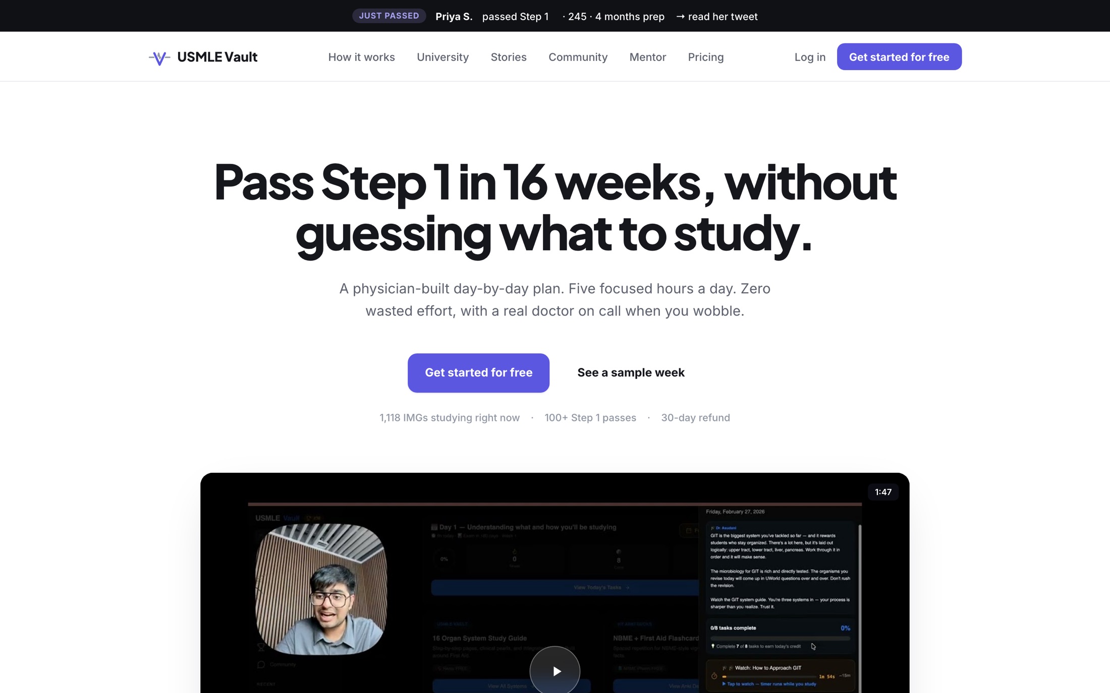 BeforeAfter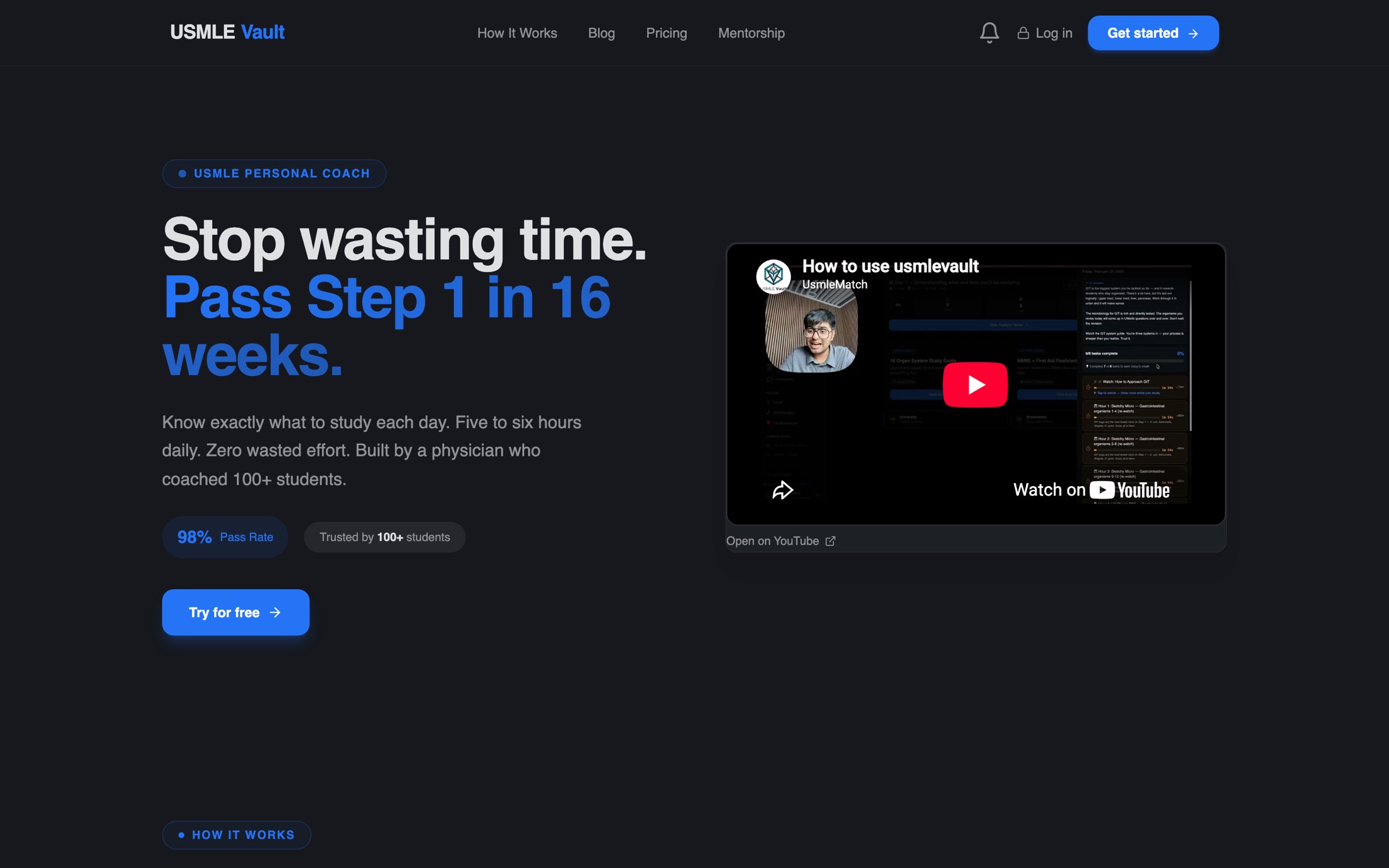
- Ground
- DarkLight
- Hero media
- YouTube embedIn-page player
- Proof in the hero
- One claimThree checkable facts
Today
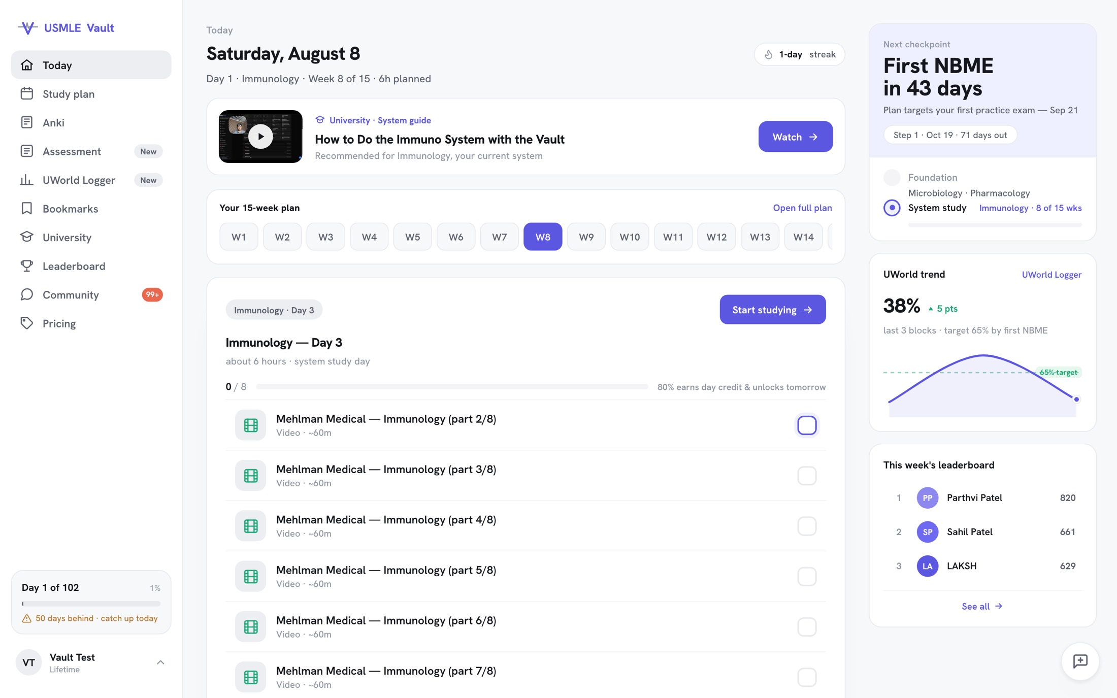 BeforeAfter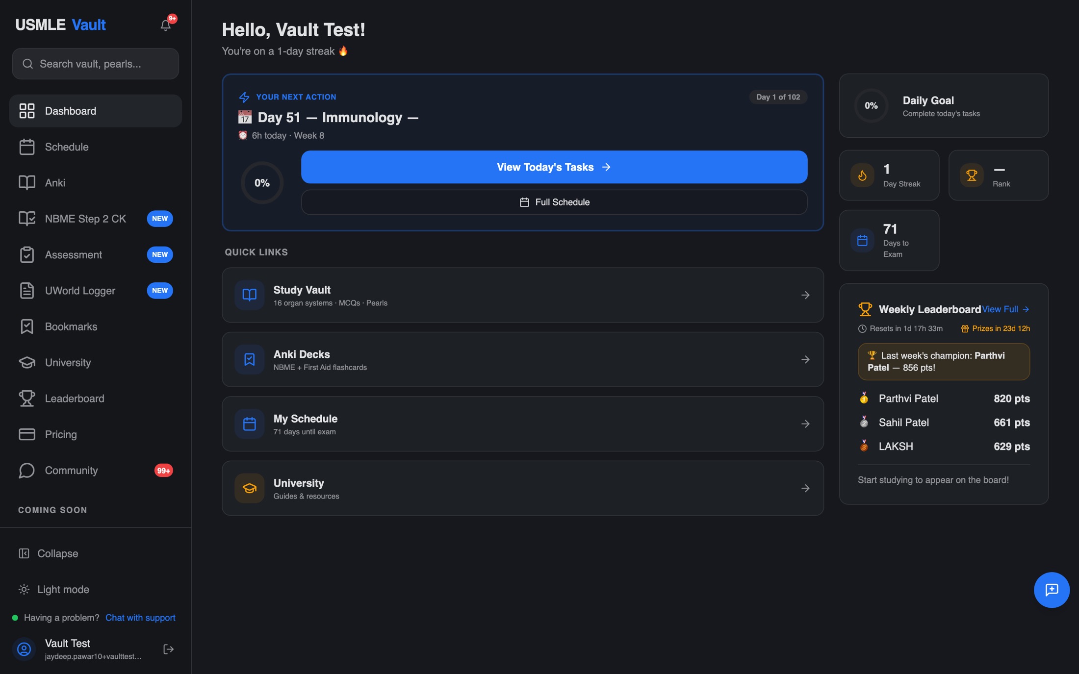
- First thing you see
- A greetingToday's tasks
- Clicks to the task list
- 10
- Decorative emoji
- ThroughoutNone
Study plan
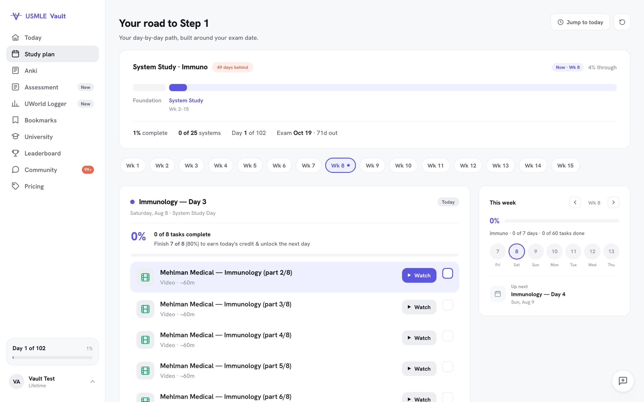 BeforeAfter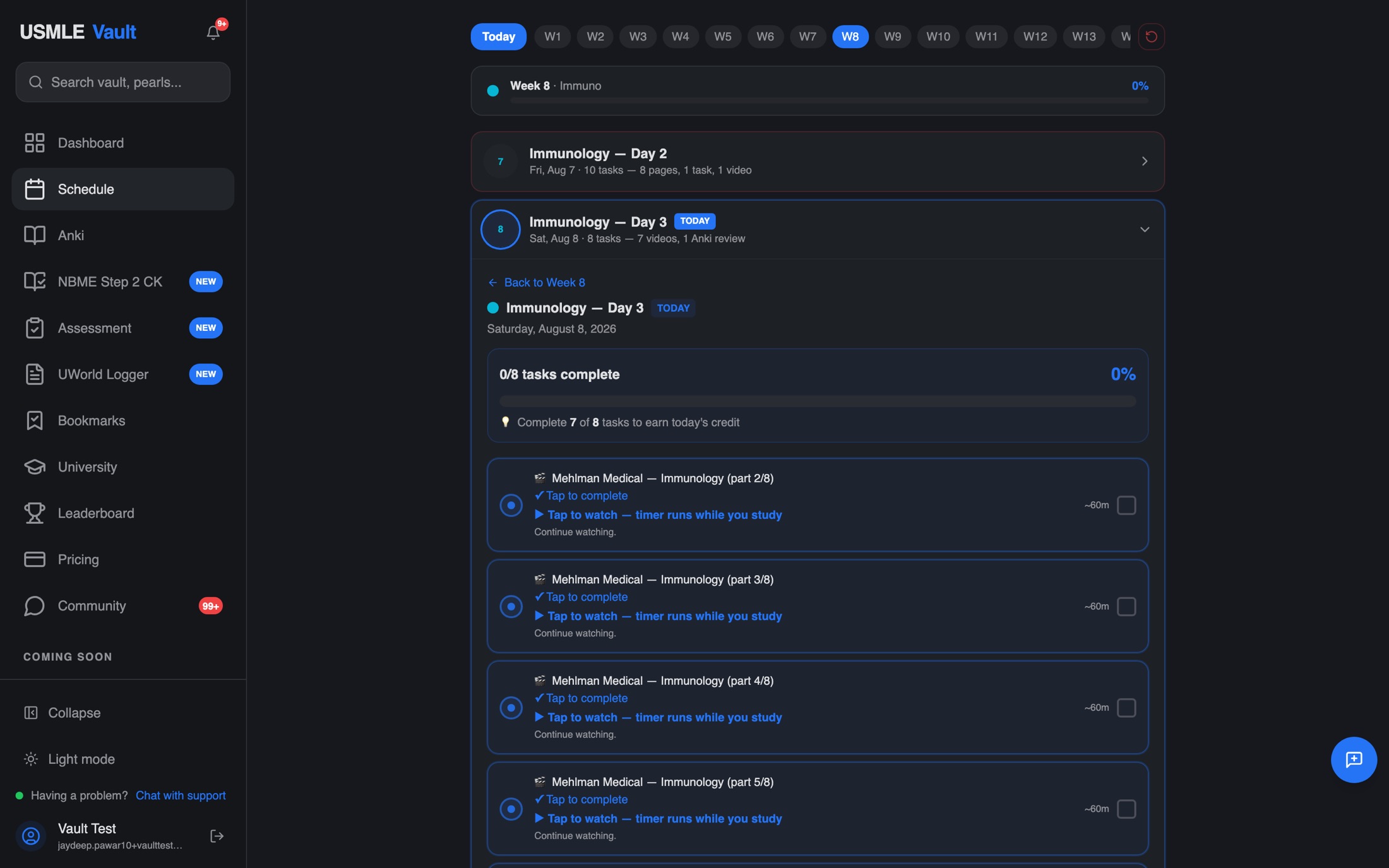
- Instructions per task
- 3 lines1 button
- Nested boxes
- Four deepFlat rows
- Plan context
- Week numberPhase, week, days behind
Vault library
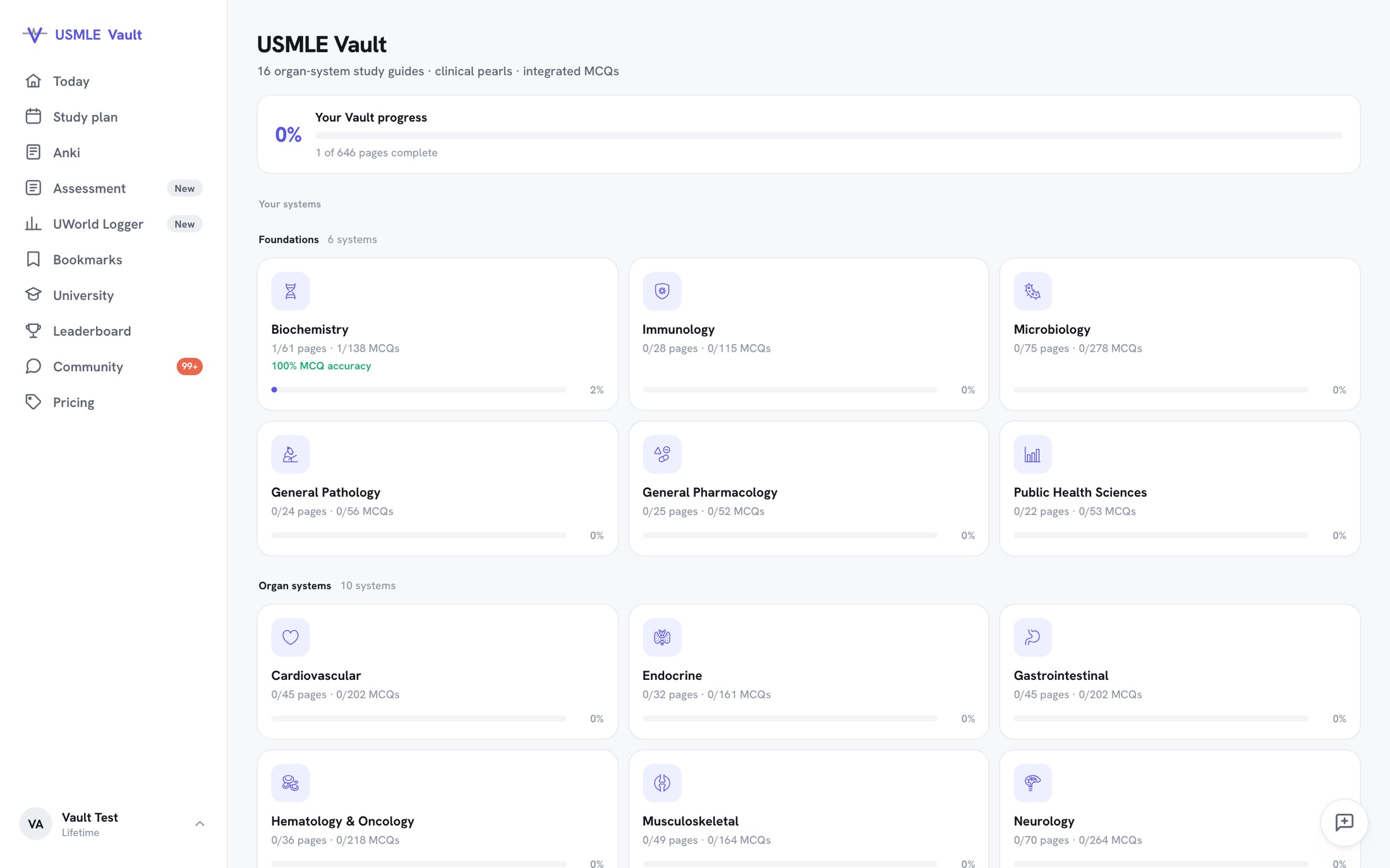 BeforeAfter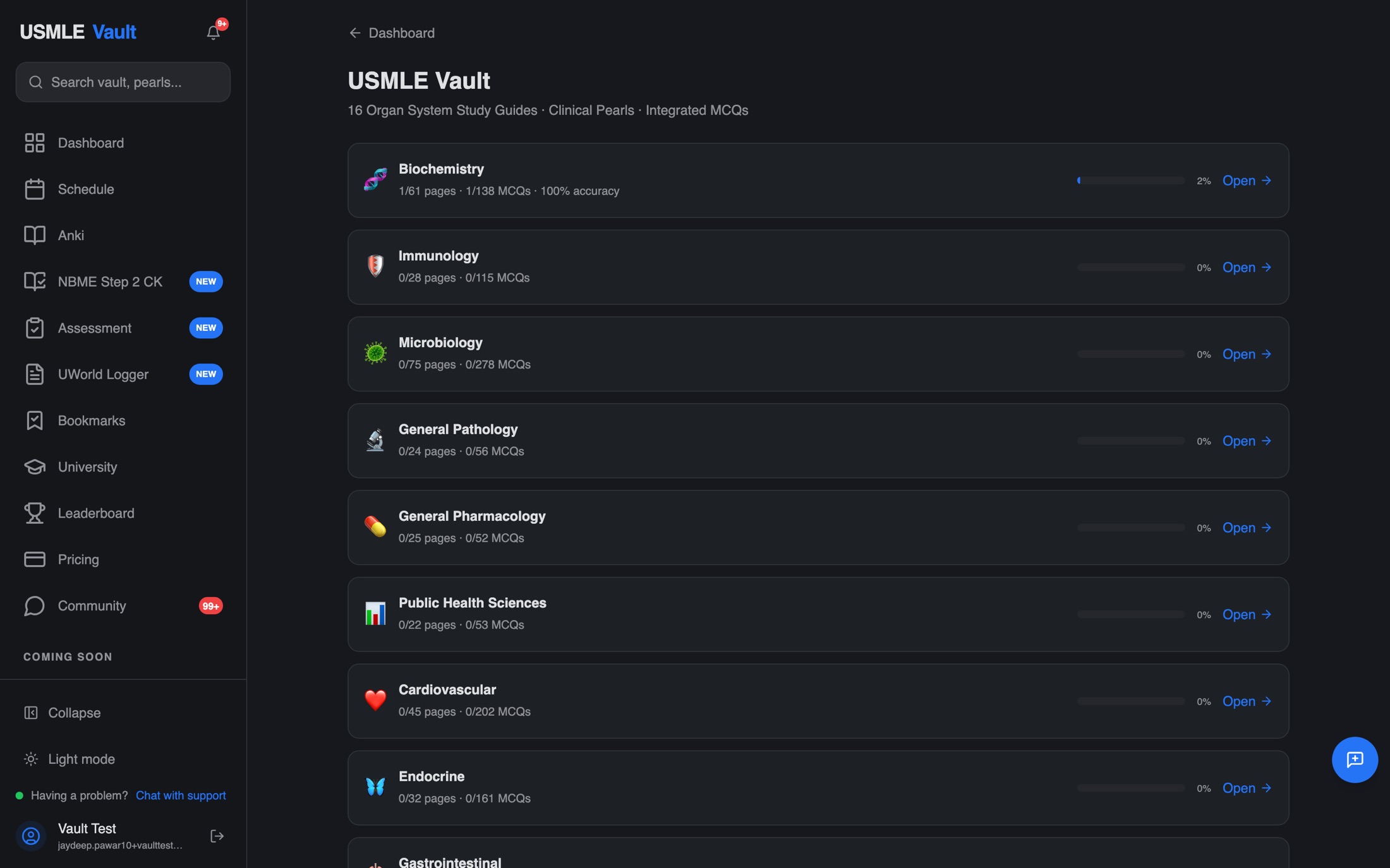
- System icons
- EmojiOne line-icon set
- Structure
- One flat listFoundations + organ systems
- Overall progress
- Not shown1 of 646 pages
Anki — session home
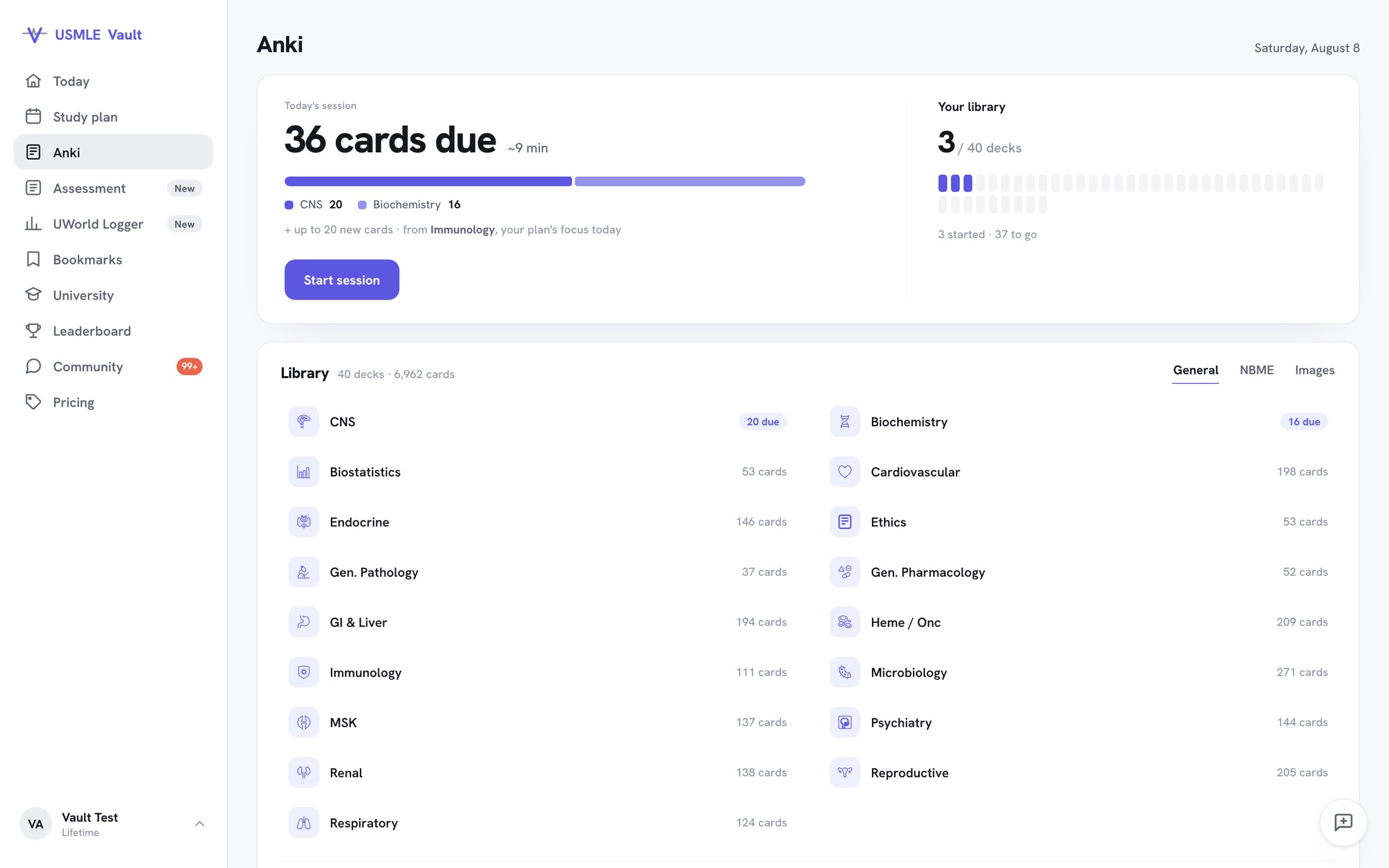 BeforeAfter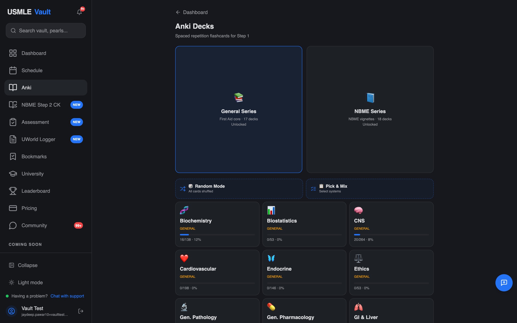
- What you open into
- 40 decks36 cards due · ~9 min
- Session end
- NoneA finish line
- New cards
- UnscopedTied to today's plan
- Typefaces
- 31
- Design
One calm light shell and a single indigo replace three typefaces, decorative glow, and a wall of emoji-labelled deck tiles.
- Research
We tore down how Anki, Quizlet and UWorld bound a study session, then capped and interleaved ours across systems with a clear finish line.
- Engineering
Designed on the Krit canvas and shipped straight to production React, mobile-first. No mockup handoff, and new cards are scoped to the student's live study plan.
Leaderboard
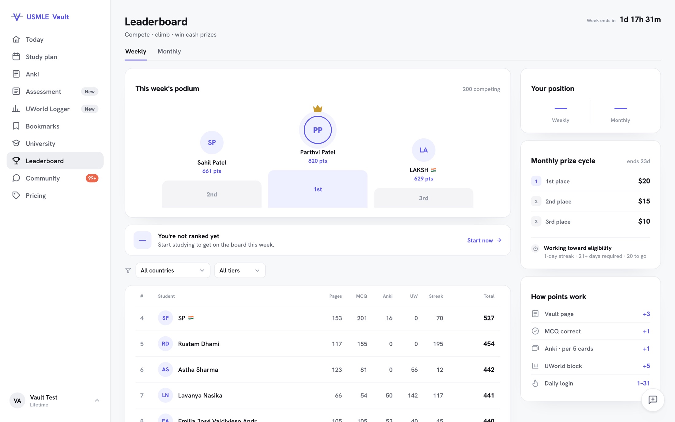 BeforeAfter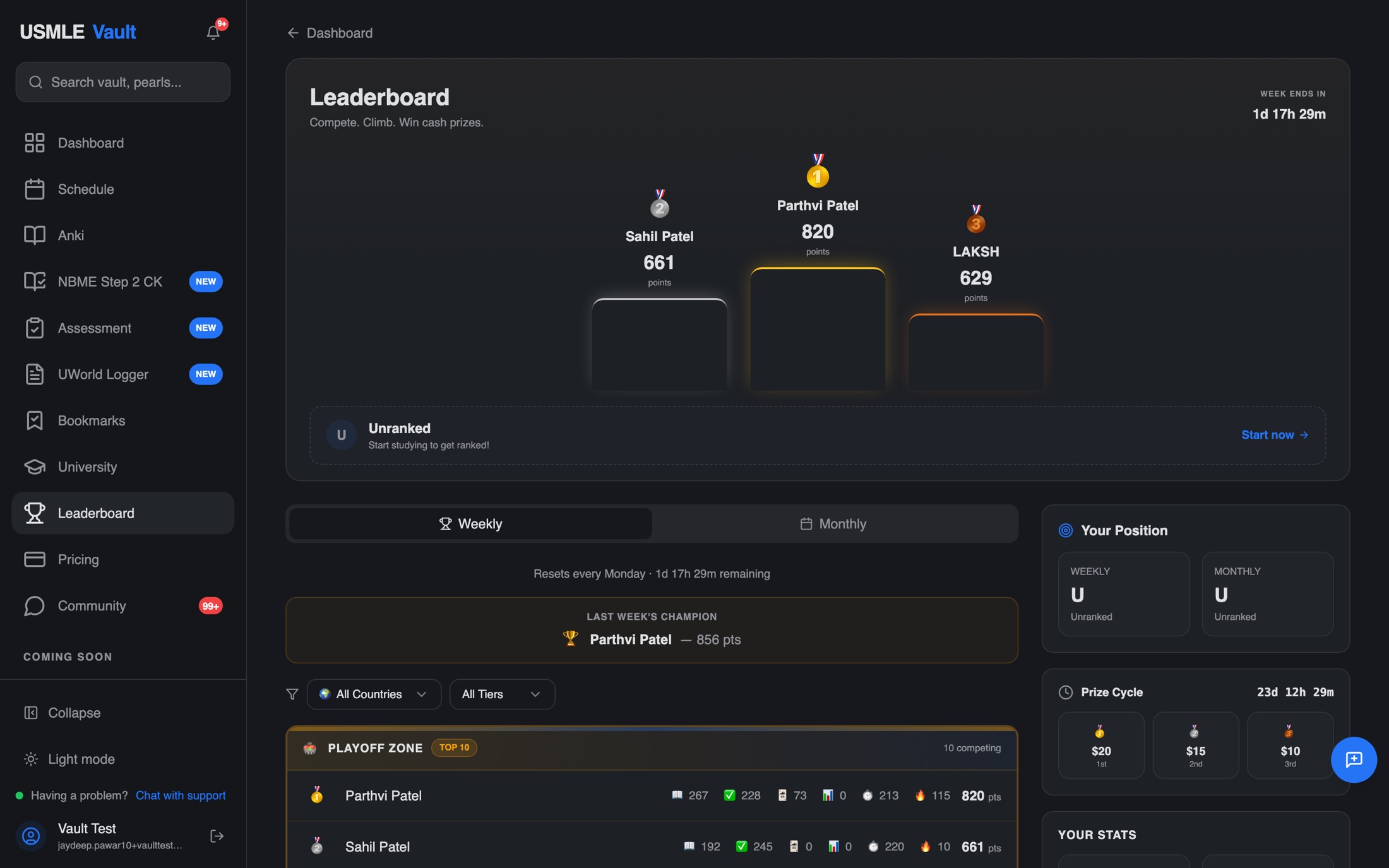
- Stat columns
- Six emojiSix labels
- How points work
- UnexplainedOn the page
- Accent colors
- FourOne indigo
The result
Product revenue per week. The 18 weeks before the redesign shipped, against the 5.4 weeks after.
Weekly revenue after the redesign went live on 30 June 2026. 86 purchases became 95, in a third of the time.
Still 3.1× with every sale from the new welcome offer stripped out of the after period.
The founder's Stripe totals, not our estimate. A $87 welcome offer launched in the same window, so we show the multiple with and without it. Five weeks of correlation after a redesign, not a controlled test.
The challenge
USMLE Vault had real content and real students, but it looked assembled screen by screen. Three typefaces, color everywhere, decorative gradients and glow. The medical credibility the content earned, the interface gave away.
Flagship features were hard to find, and the whole thing strained on mobile, where most students actually study. Every new screen drifted a little further from the last.
What we did
Designed on the canvas, not in a doc
Every screen was drawn, critiqued against a hard rulebook, and scored on a live Krit canvas before a line of React. Decisions got made in pixels, then ported straight to code.
One visual language, written down
We replaced three fonts and a rainbow of accents with a single typeface and one calm indigo, then codified it as a 25-rule design system in the repo, so the founder's own agents stay on-brand after we leave.
Real usage set the priorities
We let product analytics decide what to redesign first, then audited each redesign back against the numbers it was meant to move, including honestly flagging when it did not.
Design and engineering in one loop
The same loop that redesigned the UI also reverse-engineered and safely merged the founder's parallel backend rewrite. No designer-to-developer handoff seam.
Moments worth telling
The canvas as a decision engine
138 cards in one sitting became a session with a finish line.
When a deck dumped 138 cards at once, we did not just restyle it. We tore down how Anki, Brainscape, Quizlet and UWorld bound a study session, then designed a capped, interleaved session with a clear finish line, and tied new cards to the student's study plan. That last link is something the bigger tools cannot do.
No docs, no meetings
The code was the communication.
The founder rebuilt the scheduling engine in parallel: fifteen commits, no spec, no walkthrough. We read the intent from the commits and the diff, reconstructed exactly what it did, and folded it into our redesign with a single conflict and a green build.
Trust by default
We redesign what is there. We do not invent.
Unprovable stats got cut, not faked. When a fix overreached, we rolled it back to what the product actually does. That discipline is what lets a founder hand you their product without watching every pixel.
Designed on the canvas. Shipped to code. No handoff.
How the Founder Sprint works
What shipped
- One documented visual language across landing, auth, onboarding, dashboard, schedule, focus mode and Anki
- Core flows shipped to production React, mobile-first
- The founder's backend engine rewrite merged safely, build green
- A design system and rulebook the founder's own agents can follow
Founder Sprint
Want this for your product?
Two weeks, side by side on a live canvas. We redesign your core flows and ship them straight to your code.